

YEAR: 2021
DISCIPLINE: PACKAGE - LABEL | BRANDING | LOGO
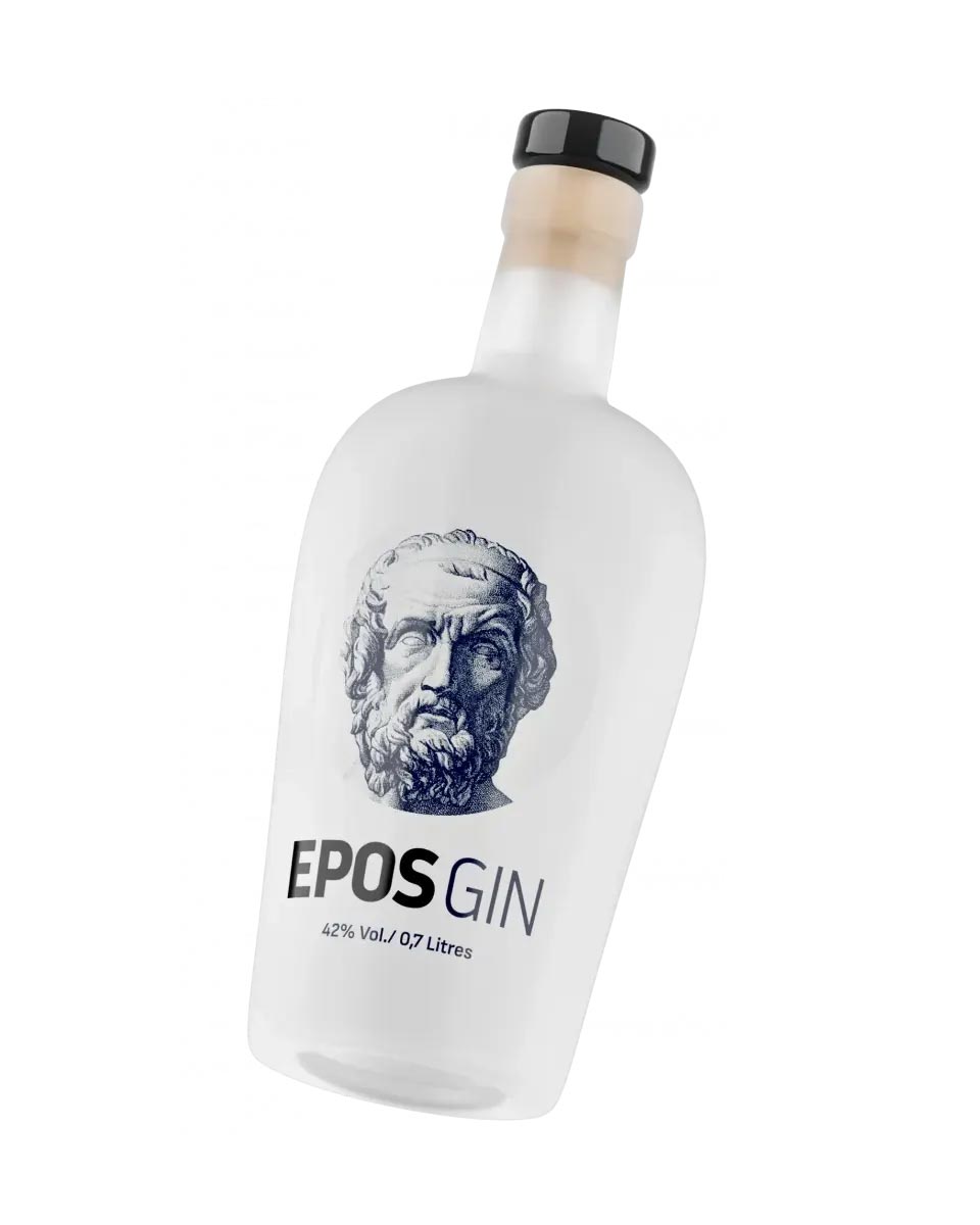
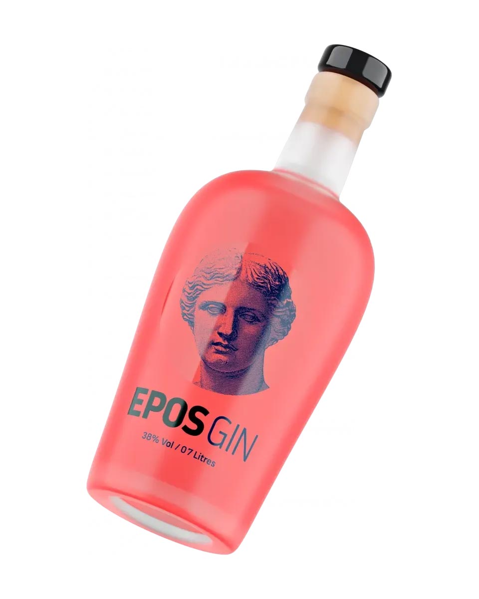
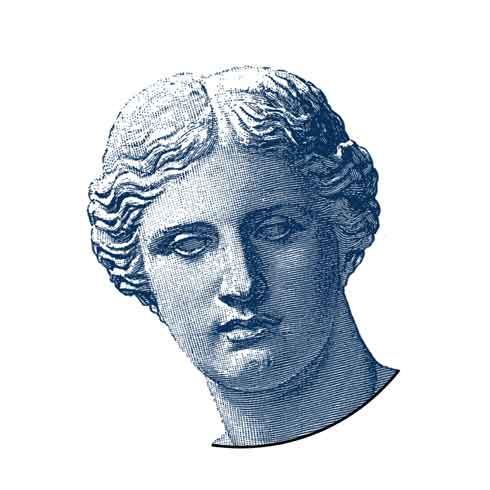
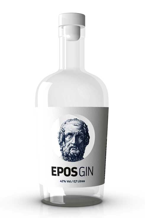
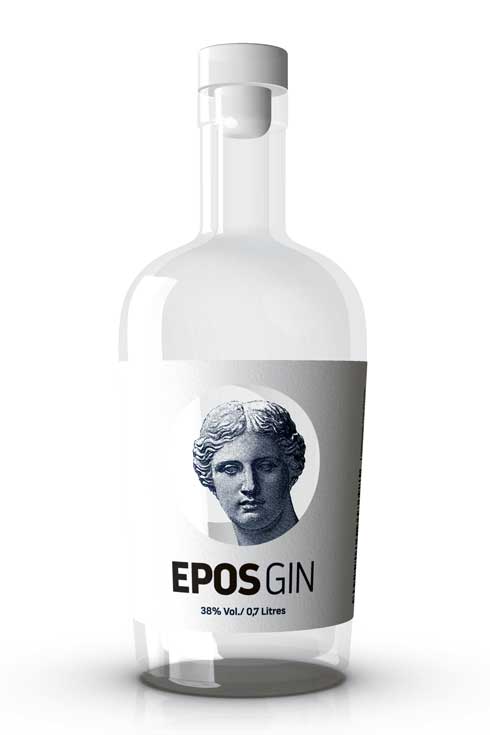
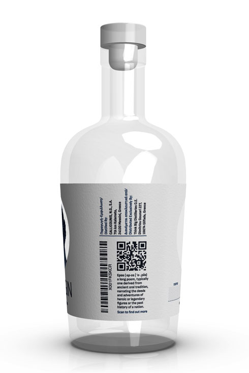
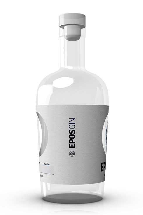
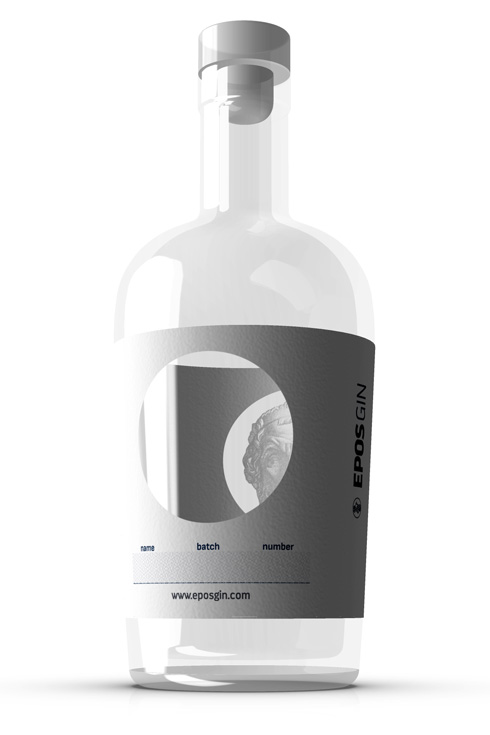
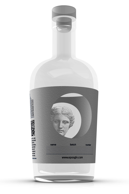
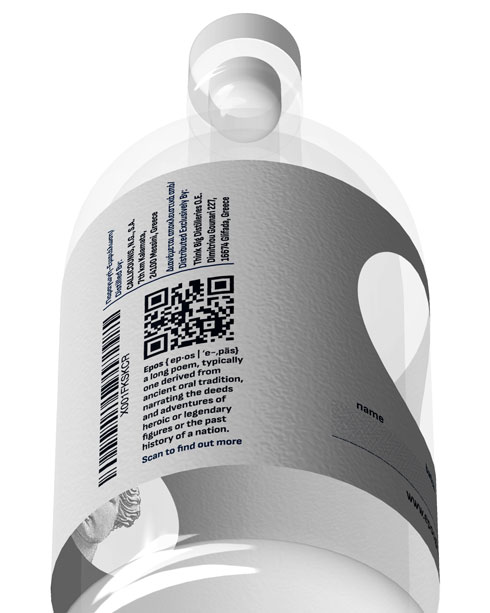
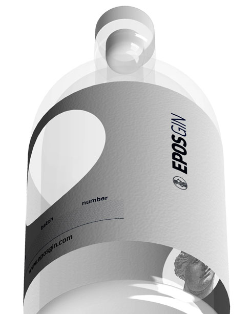
Packaging design for the spirit "EPOS GIN". The development of the branding includes the separation of the products (EPOS gin & EPOS pink grapefruit) through the symbols (Homer & Sappho) and also trough the color of the drink itself in the translucent bottle, to which the creative and the labeling was applied with direct printing on the container.
The Homer EPOS GIN label will take us to a unique world of taste, as it is made with more than 10 different herbs, spices, roots and flowers from all over Greece. Enigmatic in aromas and torrid, like the epics of Homer.
The taste of Sapfo EPOS PINK is the same as EPOS Homer, but with 38% alcohol instead of 42% and an aftertaste that leaves aromas of pink grapefruit from which its color comes from, which also serves as a differentiating element of the two packages.
The branding and character of the drink was implemented to visualize the associations of the two distinct flavors created by modern alchemists.
