Sparkling Wine Label & Packaging Design
Custom die-cut labels and gold hot foil for a Cava bottle.
YEAR : 2026
DISCIPLINE : Package DesignLabel DesignWine LabelsBranding
COCO ICE, Sparkling Wine
For COCO ICE Cava, we developed a complete sparkling wine label and packaging design system covering the bottle, front and back labels, neck band label and outer transport carton. Every element was treated as part of the same visual identity, allowing colour, typography, custom shapes and print finishes to work together as one coherent and recognisable brand expression.
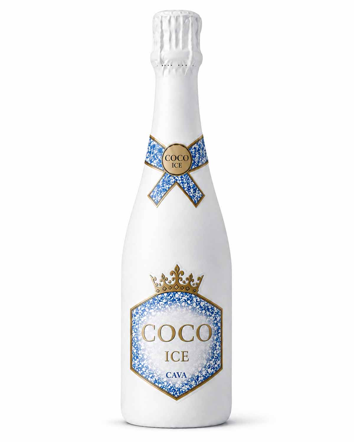
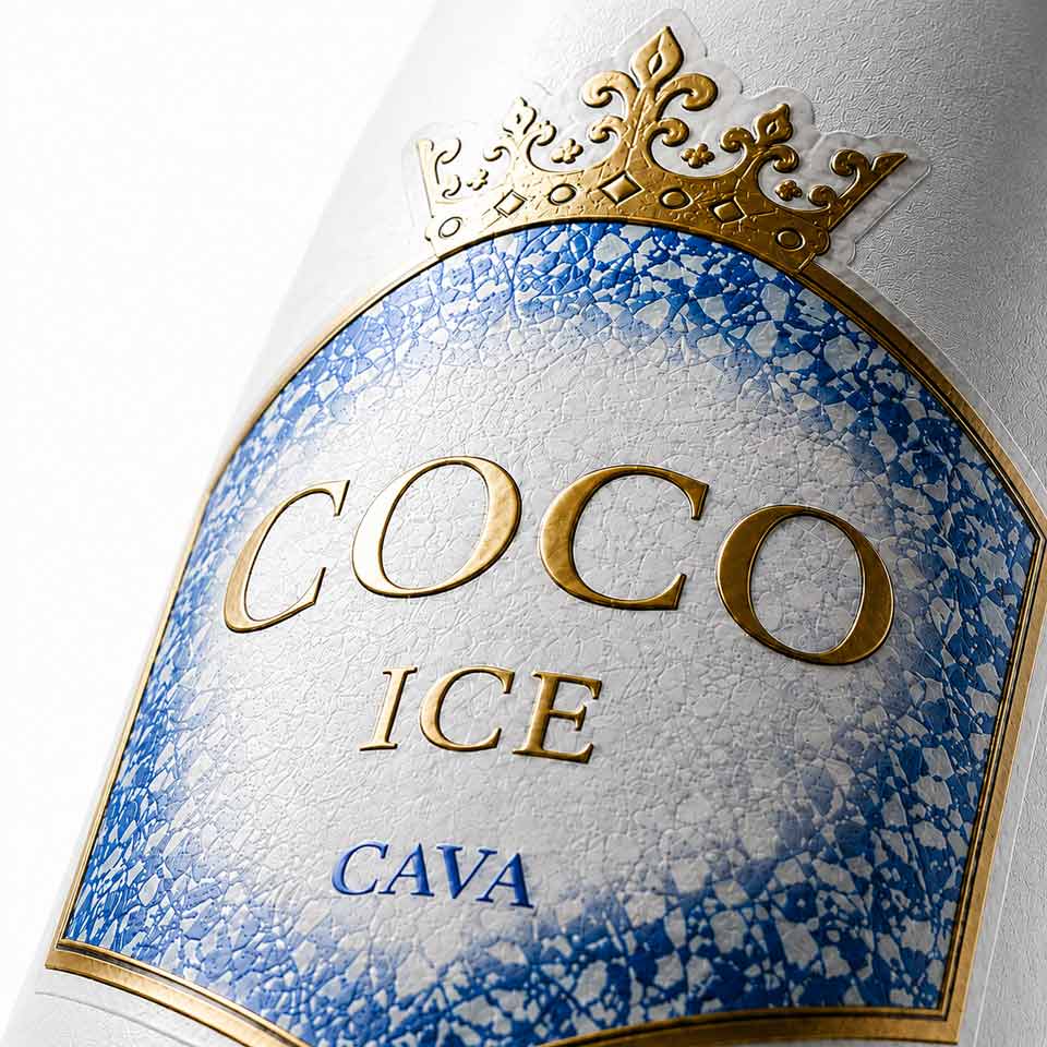
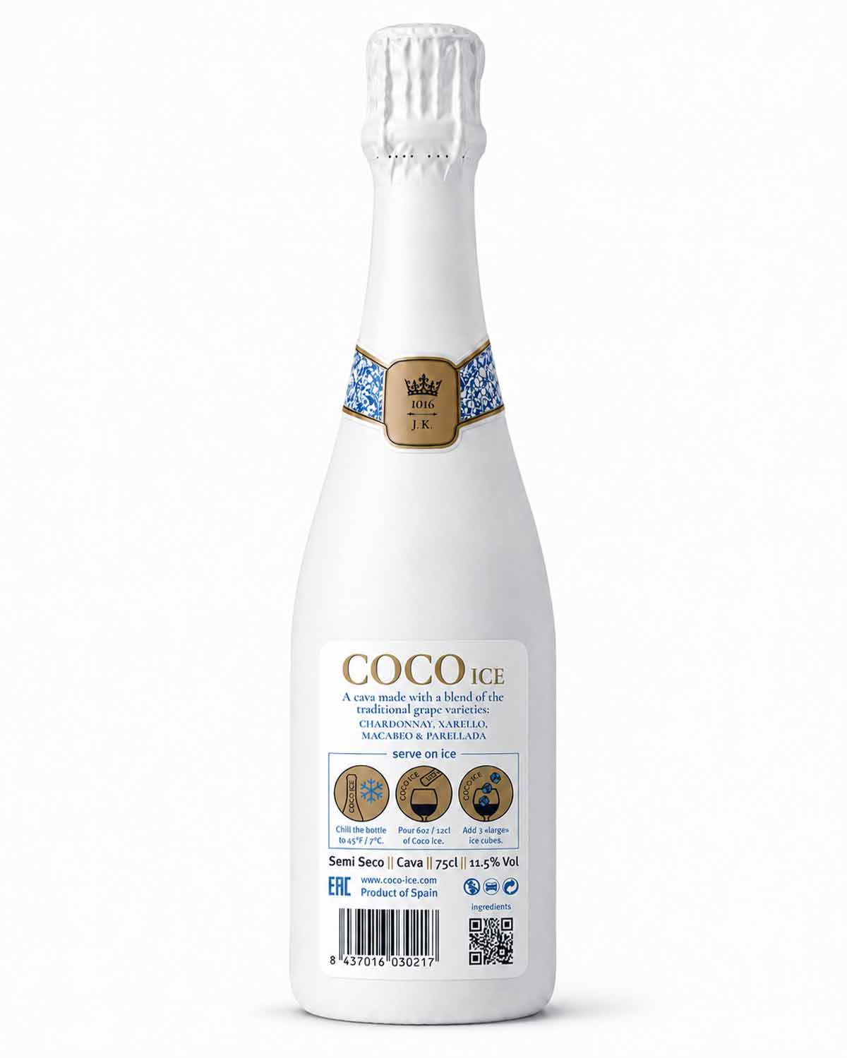
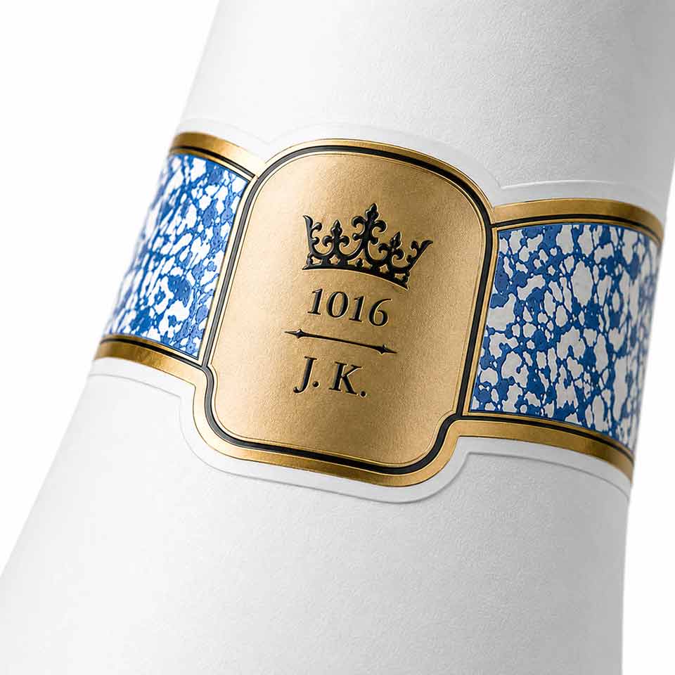
The visual direction combines an ice-inspired blue texture with crisp white surfaces and metallic gold details. The bottle itself was given a white coating, turning the glass into a clean background that strengthens the contrast and impact of the labels and their premium print finishes.
Bottle & Label Design
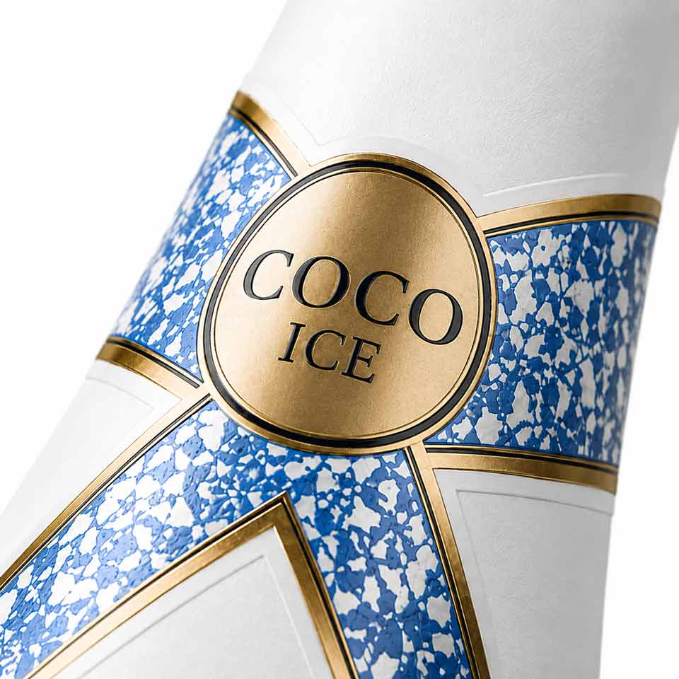
A complete label system was developed around custom die-cut shapes for the front, back and neck band of the bottle. The main label uses a distinctive geometric form crowned by an ornamental detail, while the neck label extends around the bottle in a ribbon-like structure, carrying the same blue-and-gold visual language.
The production combines gold hot foil with selective embossing on key elements of the front label. Details such as the COCO ICE name, crown and selected gold areas are given additional depth and tactility, adding a physical dimension to the design without overwhelming it. Together with the textured label stock and white bottle finish, the combination creates a clear contrast between matt, printed and metallic surfaces.
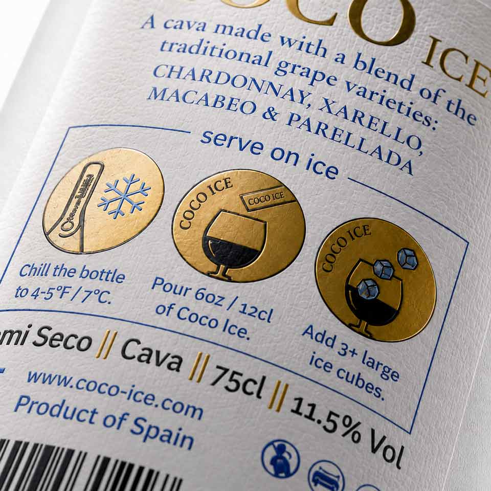
The back label was carefully structured to accommodate the necessary product information, Cava specifications, volume and alcohol content, origin, barcode, QR code, mandatory markings and illustrated instructions for serving the wine over ice. These technical and regulatory requirements were considered from the beginning as part of the design hierarchy, rather than added as an afterthought.
Wine Transport Carton Design
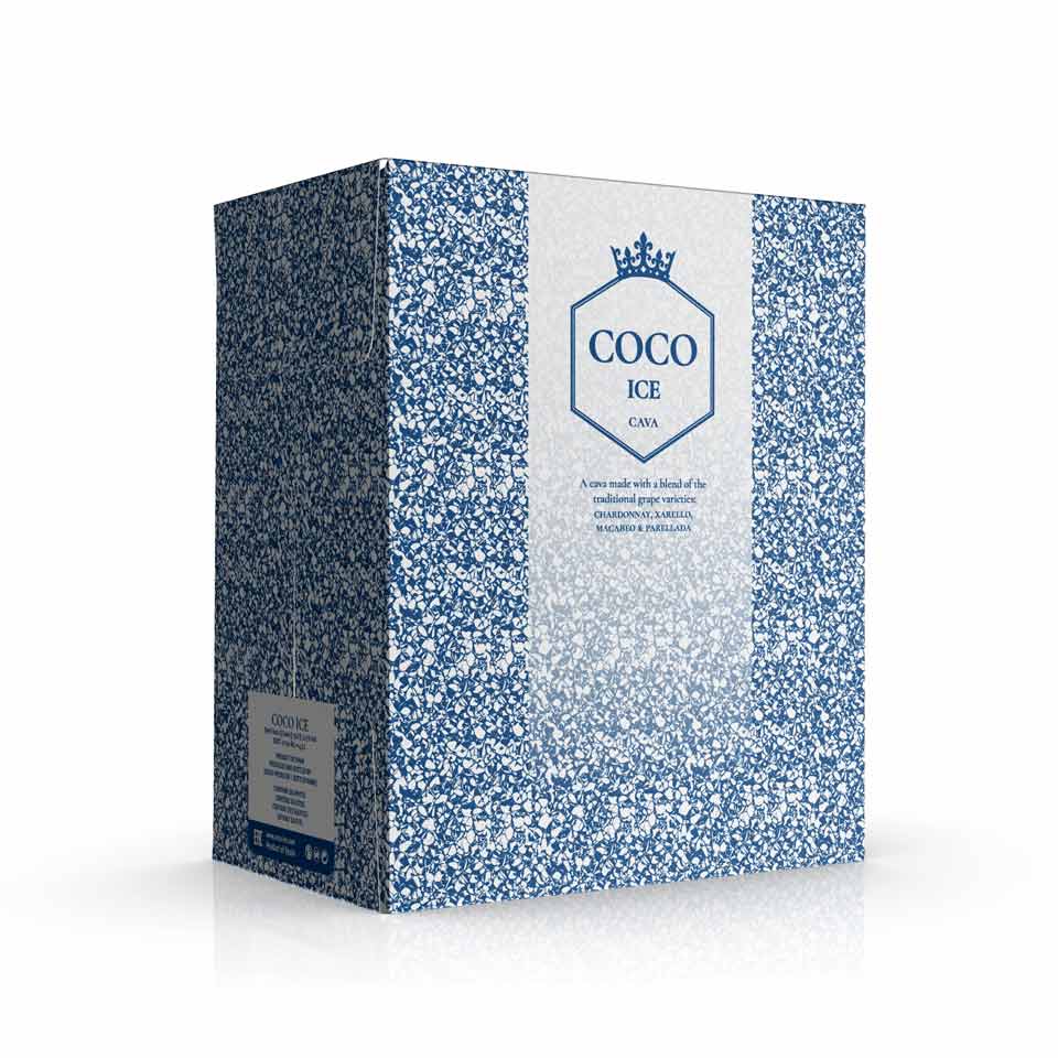
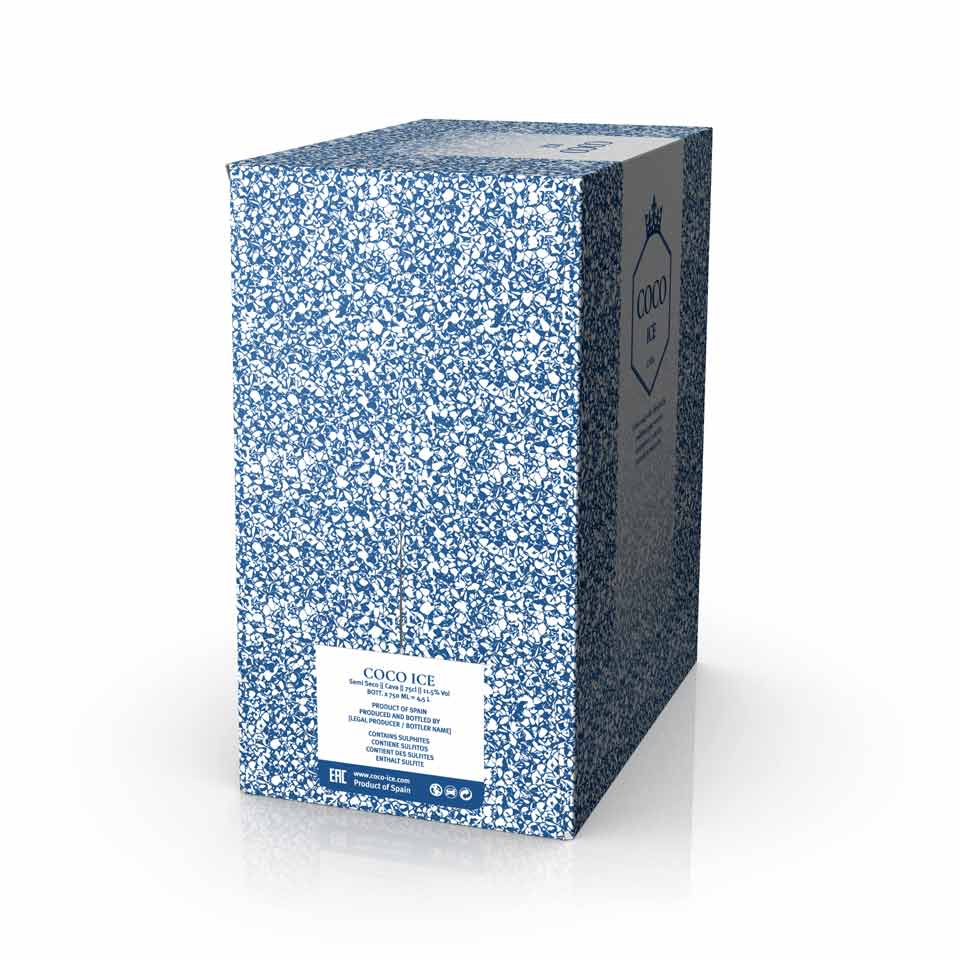
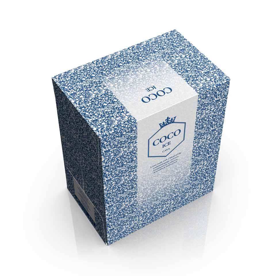
The project was extended to the wine transport packaging, including both the structural dieline and the complete graphic application of the outer carton.
The blue ice-inspired pattern continues across the box surfaces, while larger clean panels provide space for the COCO ICE identity and product information. The graphics were developed directly on the structural dieline, taking folds, joins, closures and printable areas into account so that the design remains coherent once the carton is assembled.
The result is a consistent sparkling wine packaging system, from the white-coated bottle and custom embossed labels with gold hot foil to the outer transport carton. Each component uses the same restrained visual language, creating a distinctive identity across both primary and secondary packaging.