Wine Label and Packaging Design
Minimal visual identity branding for wine
YEAR : 2021
DISCIPLINE : Label DesignWine LabelsPackage DesignBranding
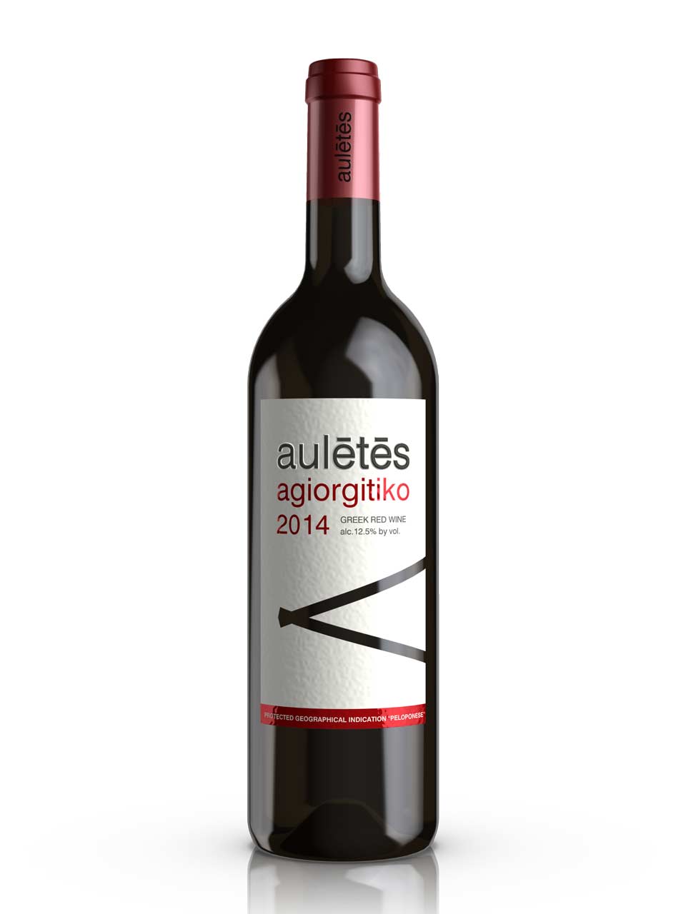
AULETES WINE
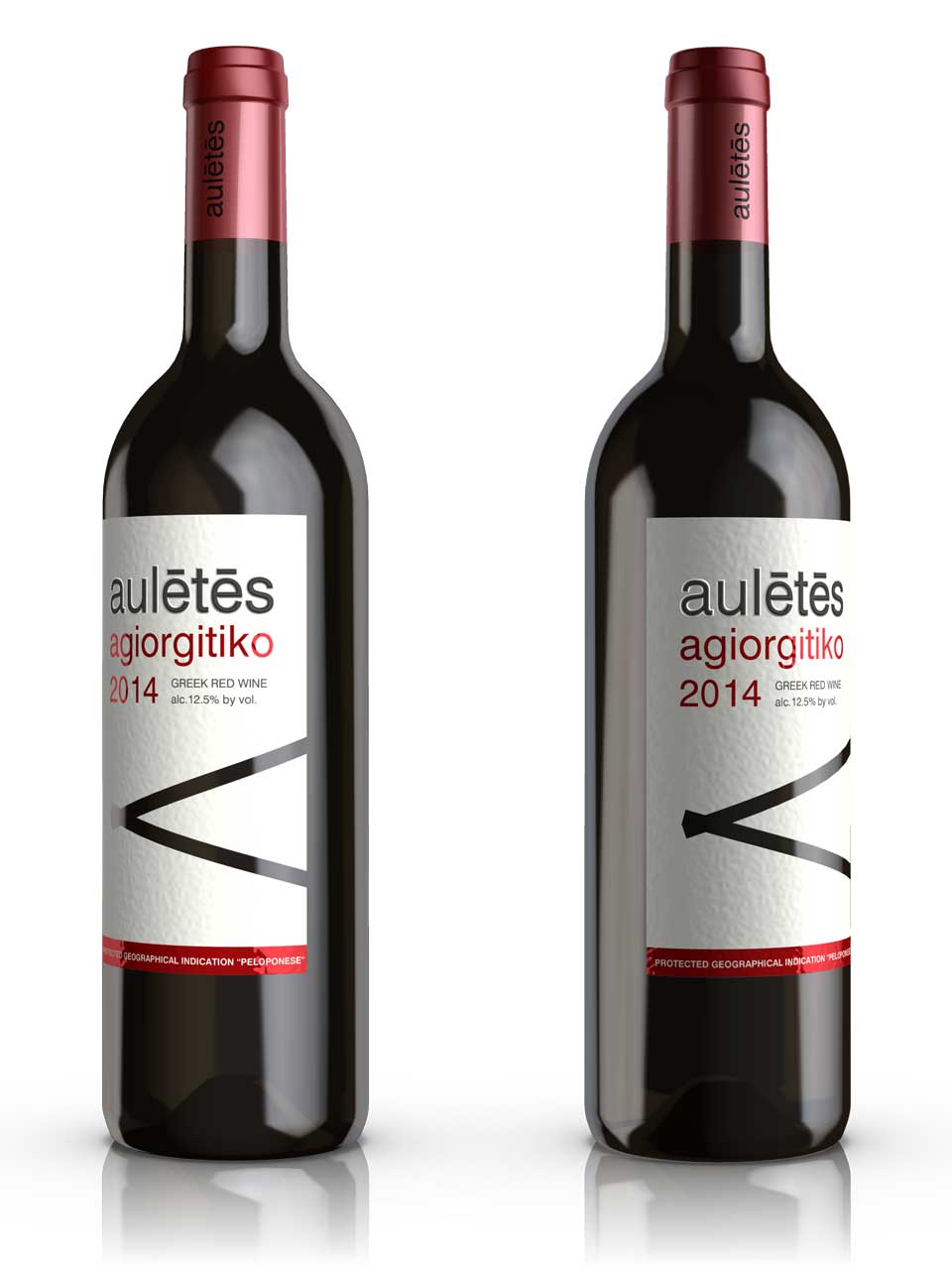
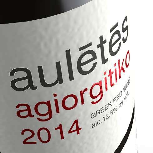
A minimalist wine label design for Auletes, featuring a conceptual approach that connects the product name to its cultural inspiration. The name "Auletes" refers to a musician who played the aulos (an ancient Greek wind instrument), which is visually referenced through a restrained illustration of a diaulos on the label.
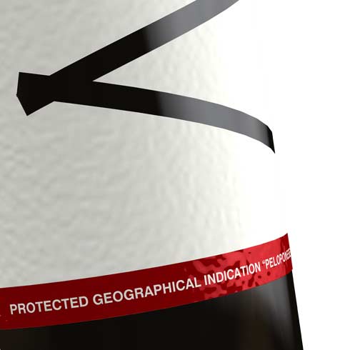
The design employs multiple production techniques to create a premium tactile experience. A precision die-cut pattern strategically reveals portions of the glass bottle beneath, creating an interplay between the label and container. This partial reveal establishes a visual rhythm while allowing the wine's color to become an integral element of the packaging design.
Embossed typography adds dimensional complexity to the surface, while the application of metallic red ink with iridescent properties creates subtle light-reflective qualities that shift as the bottle is handled. These refined details are supported by the selection of a heavyweight, textured paper stock that reinforces the product's artisanal positioning through its substantial feel and visual depth.
WINE PACKAGING DESIGN