Food & Pastry Packaging Design
Custom illustration for takeaway and delivery packaging, with typographic pastry box design.
YEAR : 2026
DISCIPLINE : Package DesignBrandingCorporate IdentityPrint Design
ROIS BROS, FOOD & PASTRY PACKAGING
For ROIS BROS, we developed a series of concepts for food, takeaway and delivery packaging, together with a range of pastry boxes. The two packaging categories called for different visual approaches, but shared the same foundation: a clear identity, careful adaptation to the actual structural templates, and full use of the box as a three-dimensional design printed surface. Packaging was treated as an important part of the overall branding, giving each proposal a distinctive and recognisable character.
Every concept was developed directly on the actual dielines, taking cuts, folds, joins and openings into account from the beginning. The graphics therefore do more than sit on a flat surface; they respond to the structure of the box and change naturally as the packaging is opened, closed and handled.
Food, Takeaway & Delivery Packaging Design
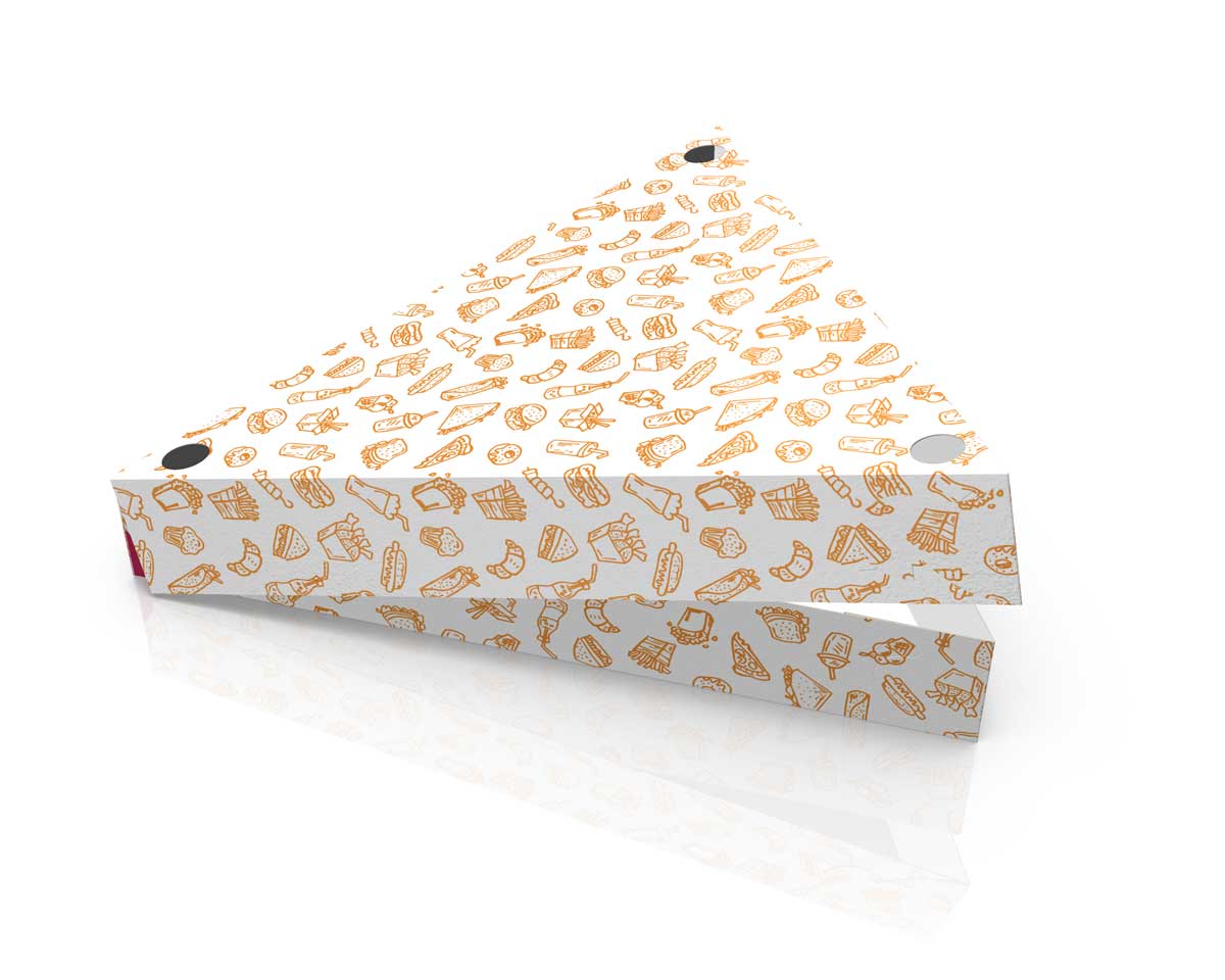
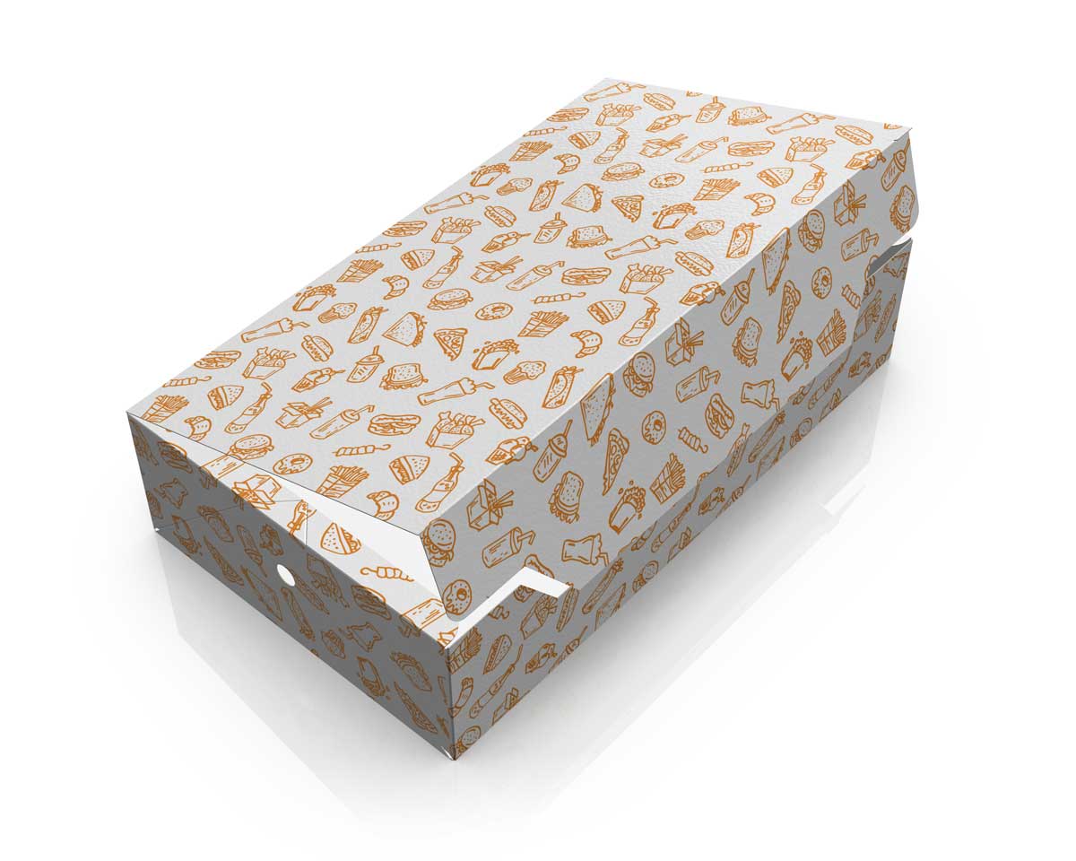
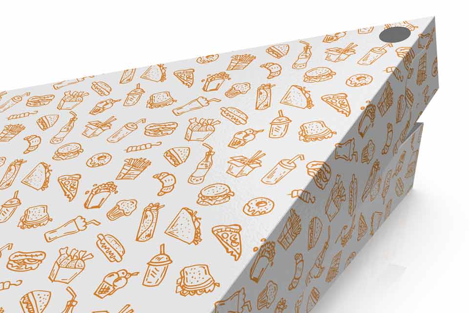
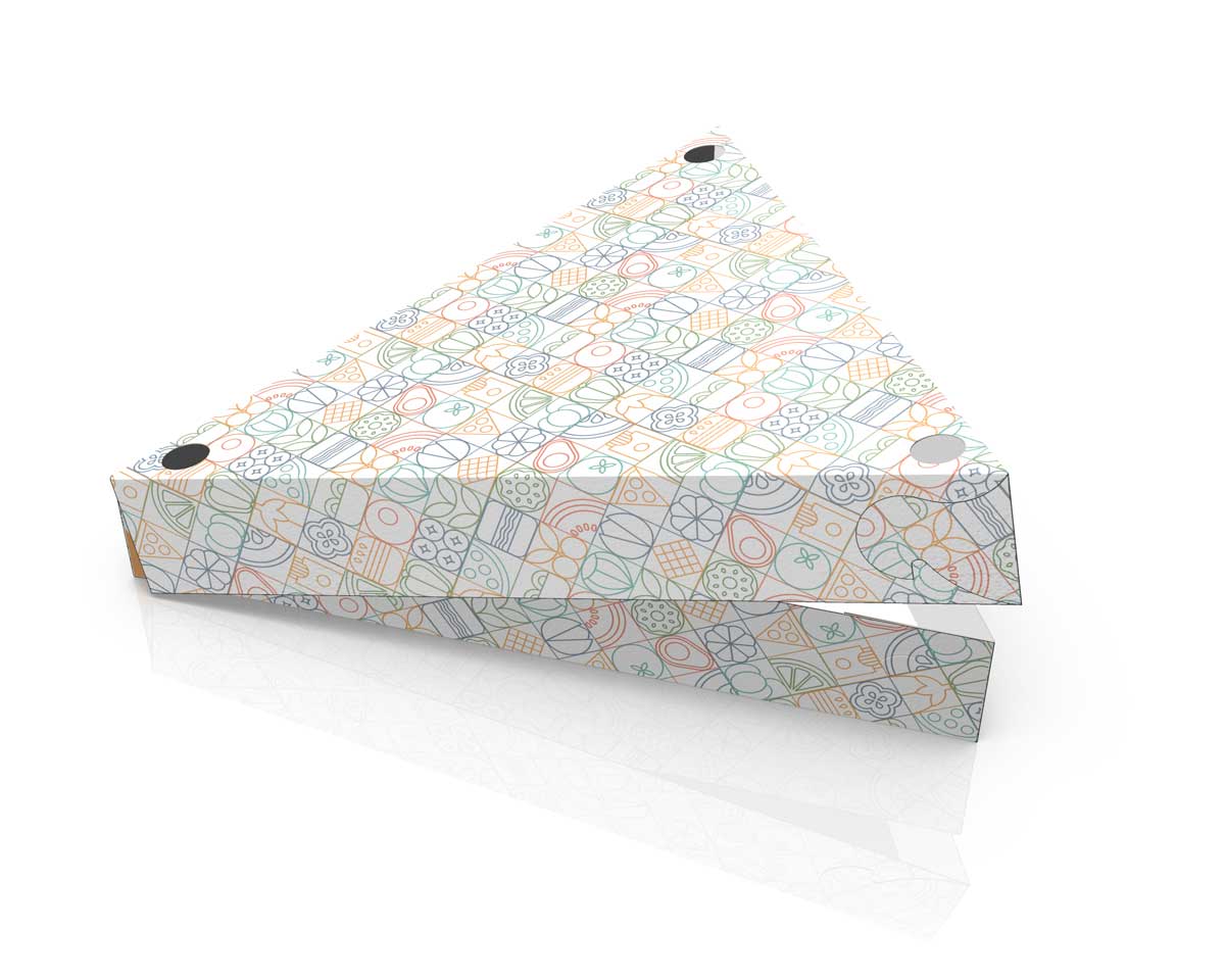
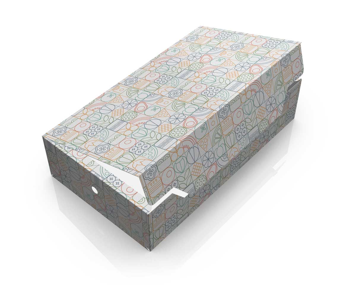
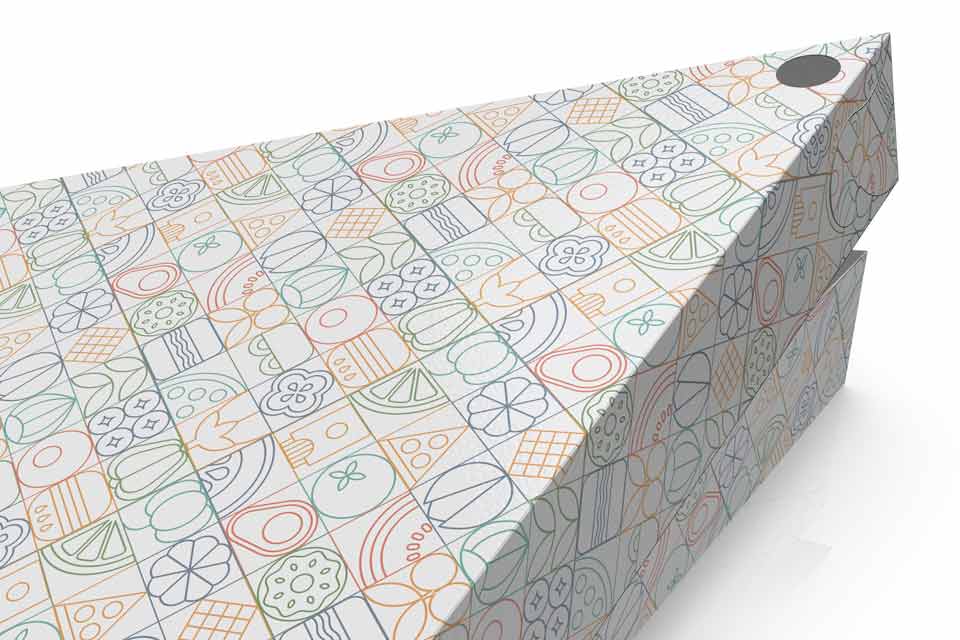
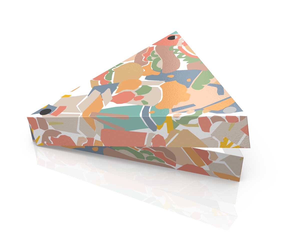
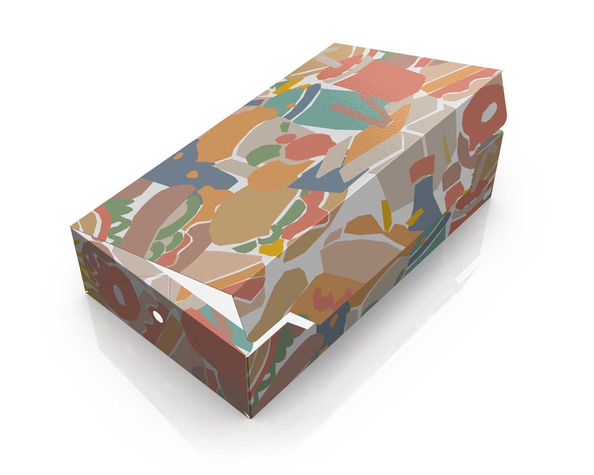
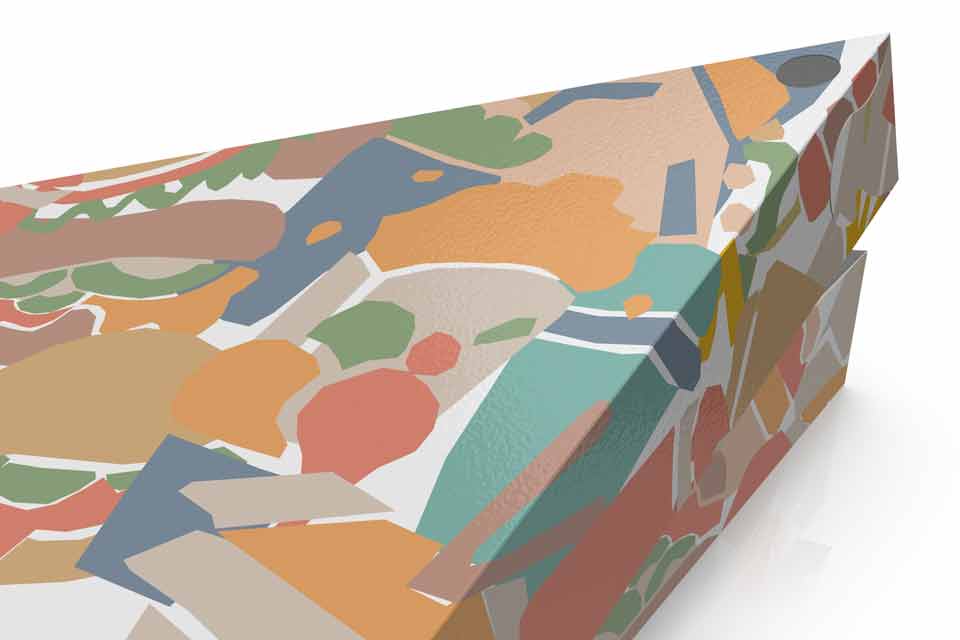
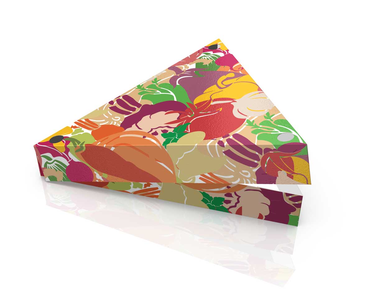
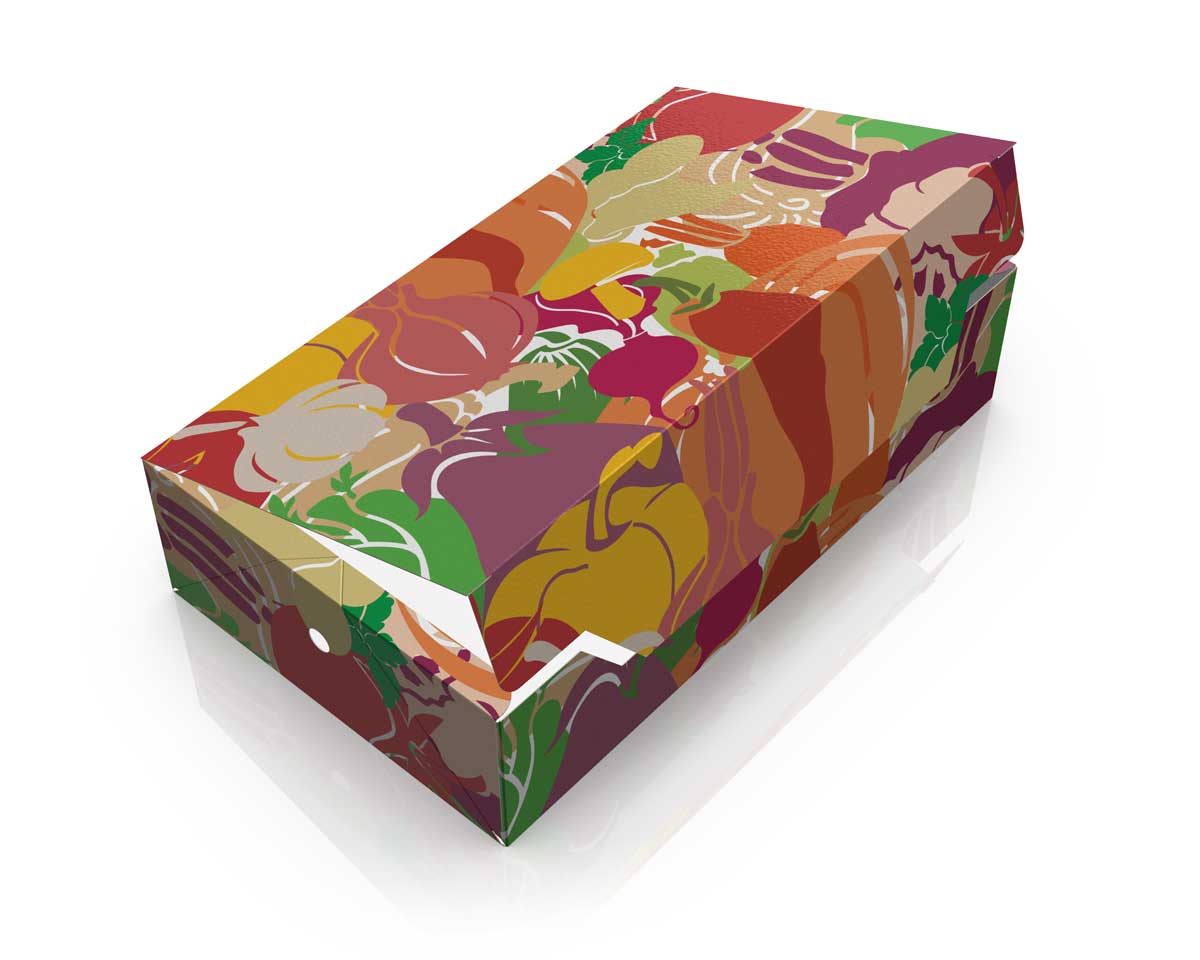
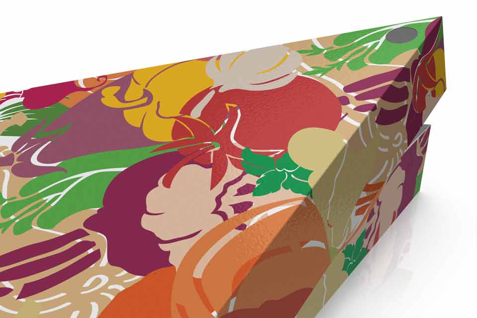
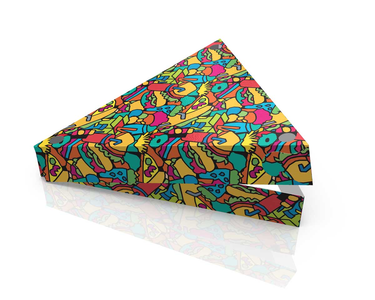
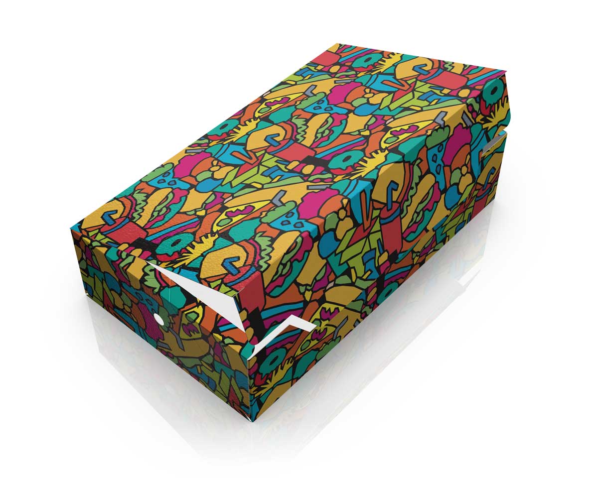
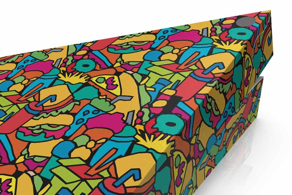
For the food packaging range, five different visual concepts were developed across two box formats. The central element of the series is the original illustration, created specifically for the project and inspired by food, ingredients and the everyday experience of takeaway dining.
The proposals range from light, linear patterns to denser and more expressive colour compositions. The illustrations extend across the entire packaging, continuing around the sides, folds and individual panels, so that each box works as a complete three-dimensional object rather than simply as a carrier for a graphic.
The result gives the takeaway and delivery packaging a strong, recognisable personality without relying on conventional logo placement or ready-made decorative patterns. The illustration itself becomes a key visual asset and can function as a distinctive element within a broader corporate identity.
Pastry Packaging Design
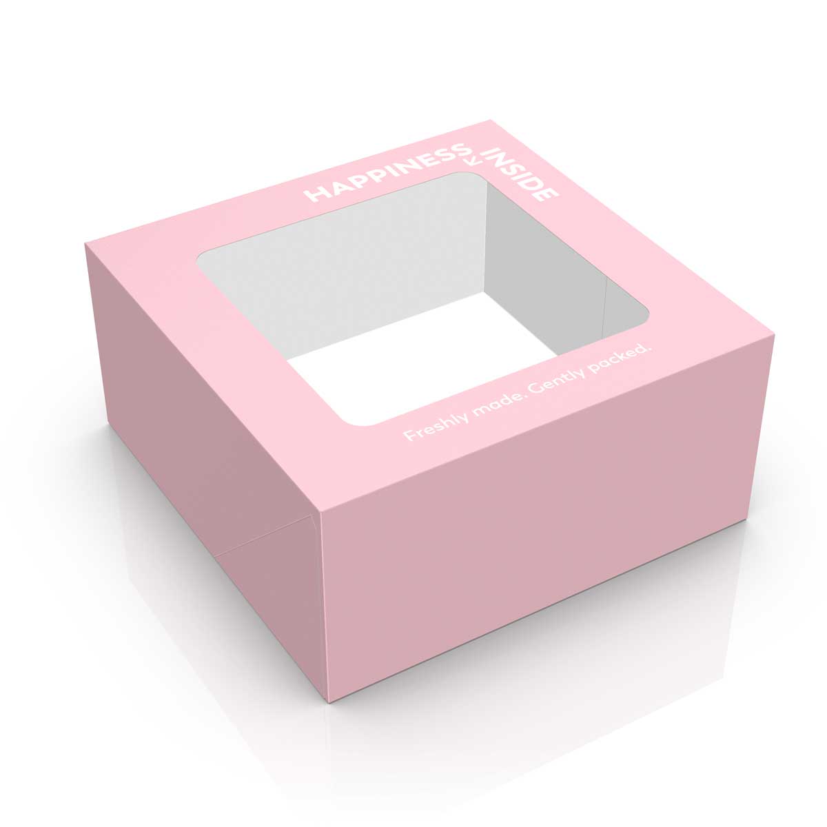
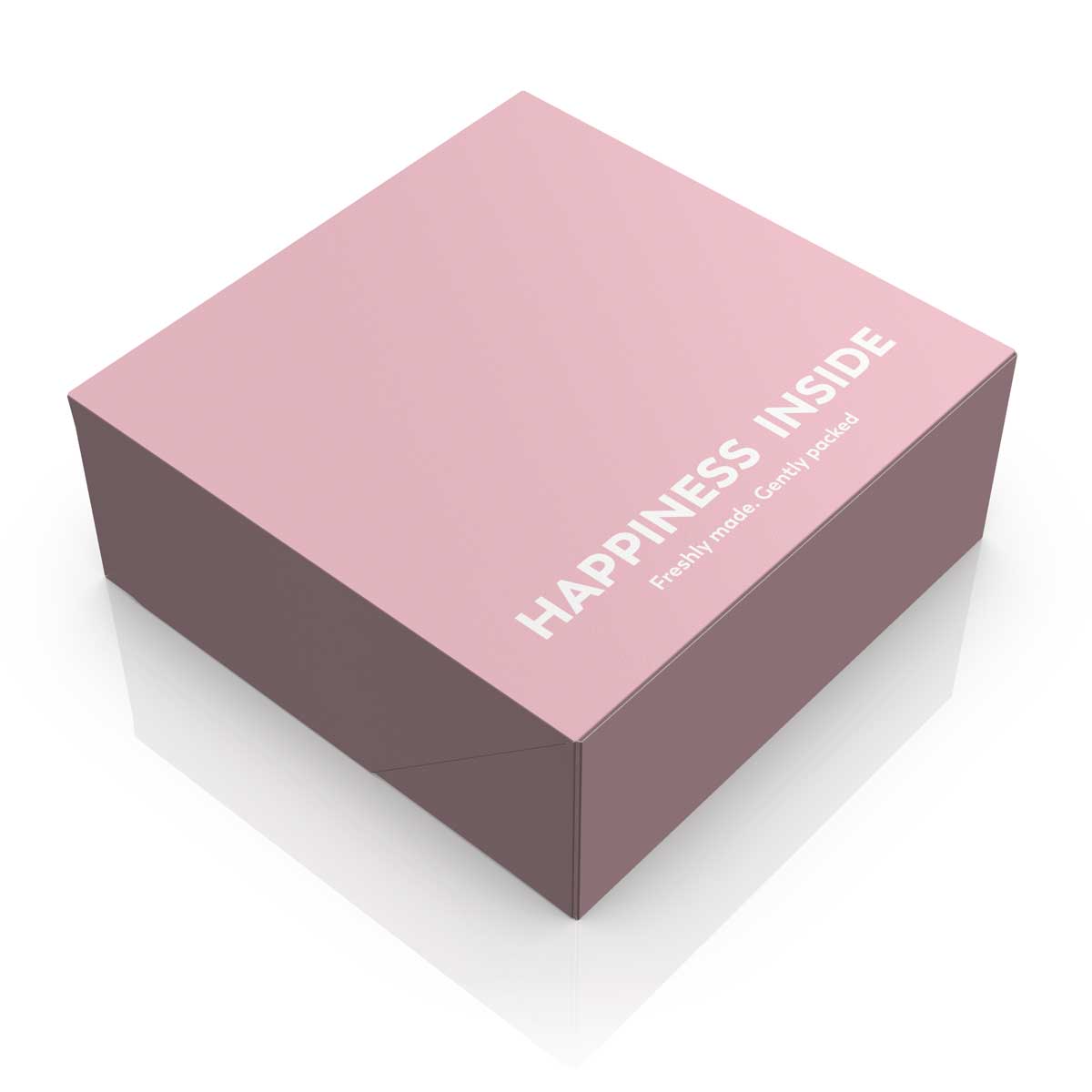
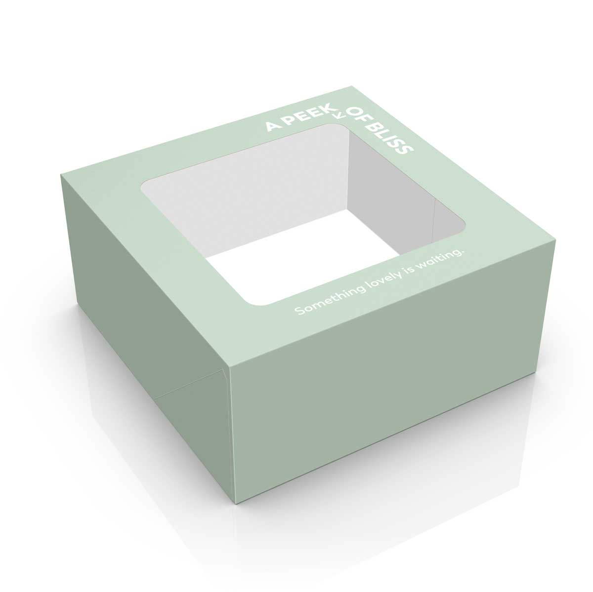
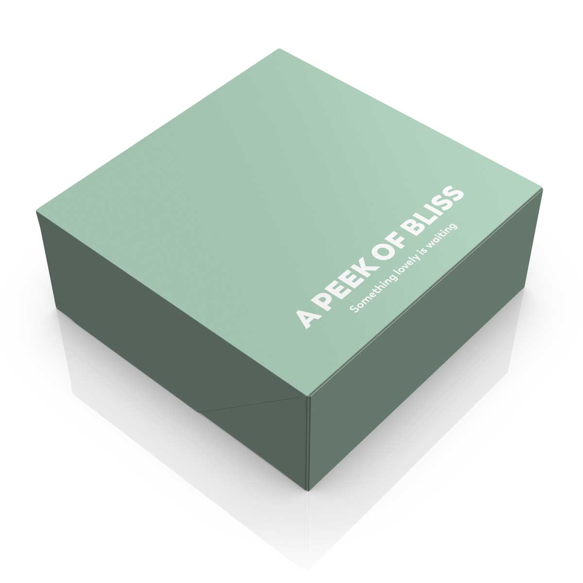
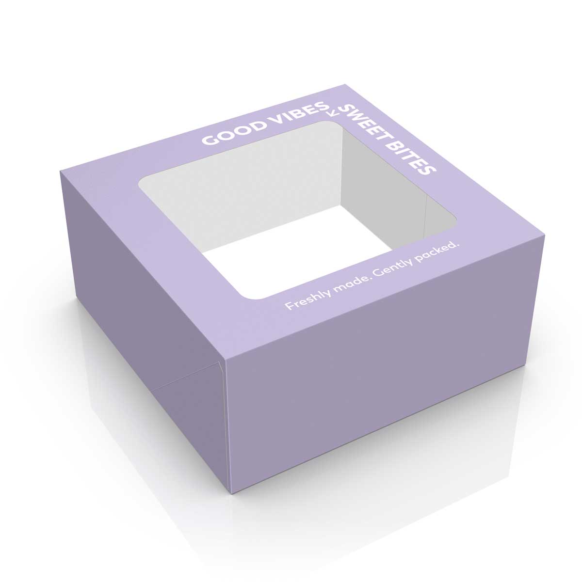
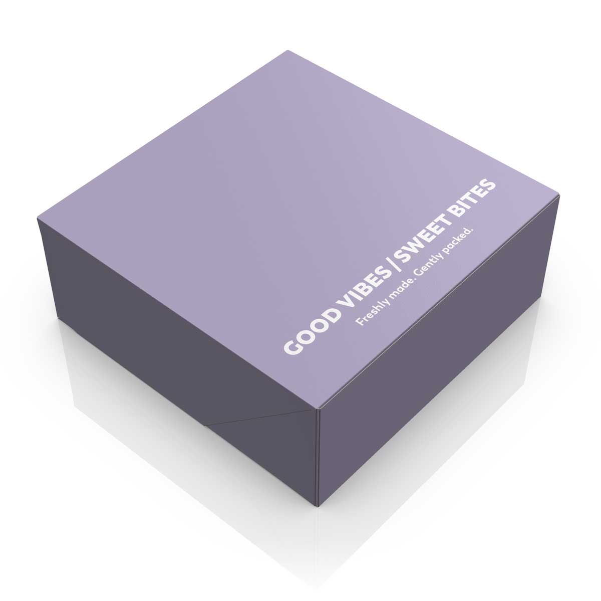
For the pastry boxes, we followed a more restrained, typography-led approach. Three different concepts were developed across two structural formats, with and without a window, using soft colour palettes, clean surfaces and short messages connected to the pleasure of sweets and the experience of opening the box.
Phrases such as “A Peek of Bliss”, “Good Vibes, Sweet Bites” and “Happiness Inside” are an integral part of the design. On the windowed versions, the typography is arranged around the opening, using the reveal of the product as part of the concept. On the closed boxes, the same idea is translated into a cleaner, more direct composition across the top surface.
The restrained palette and strong typographic focus create a contemporary pastry packaging design that remains versatile enough to adapt to different products and commercial applications. The packaging can work on its own or be customised with an additional label, while retaining a clear and distinctive visual character.