Logo & Stationery Design for a Recording Studio
Branding, Logo and Stationery Design for sound production
YEAR : 2007
DISCIPLINE : Logo DesignPrint DesignBrandingCorporate IdentityPackage Design
HYPHE SOUND
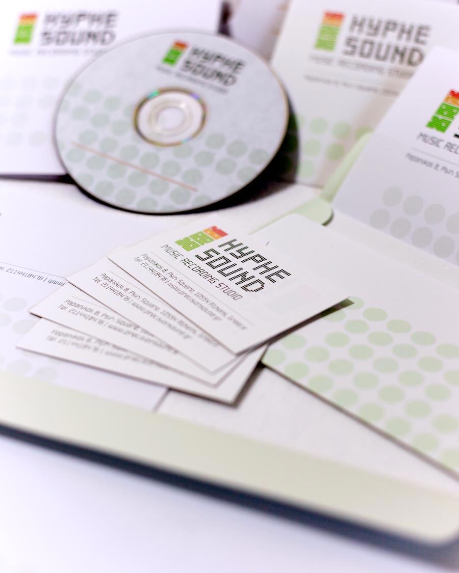
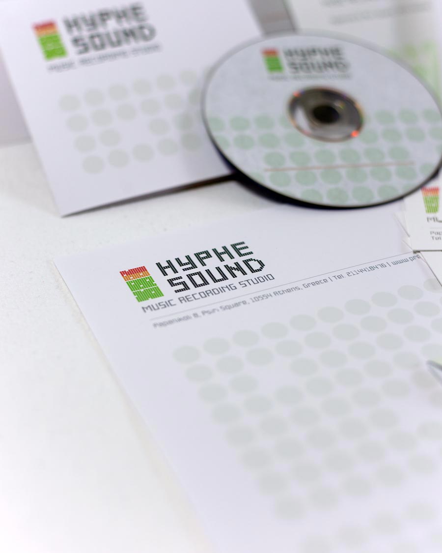
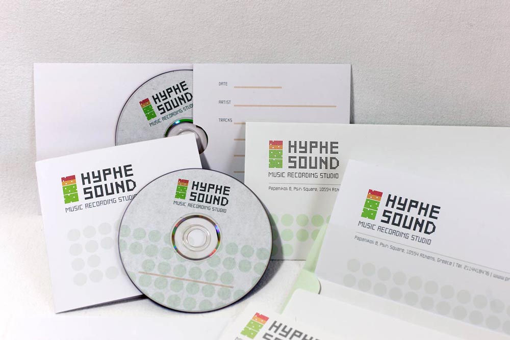
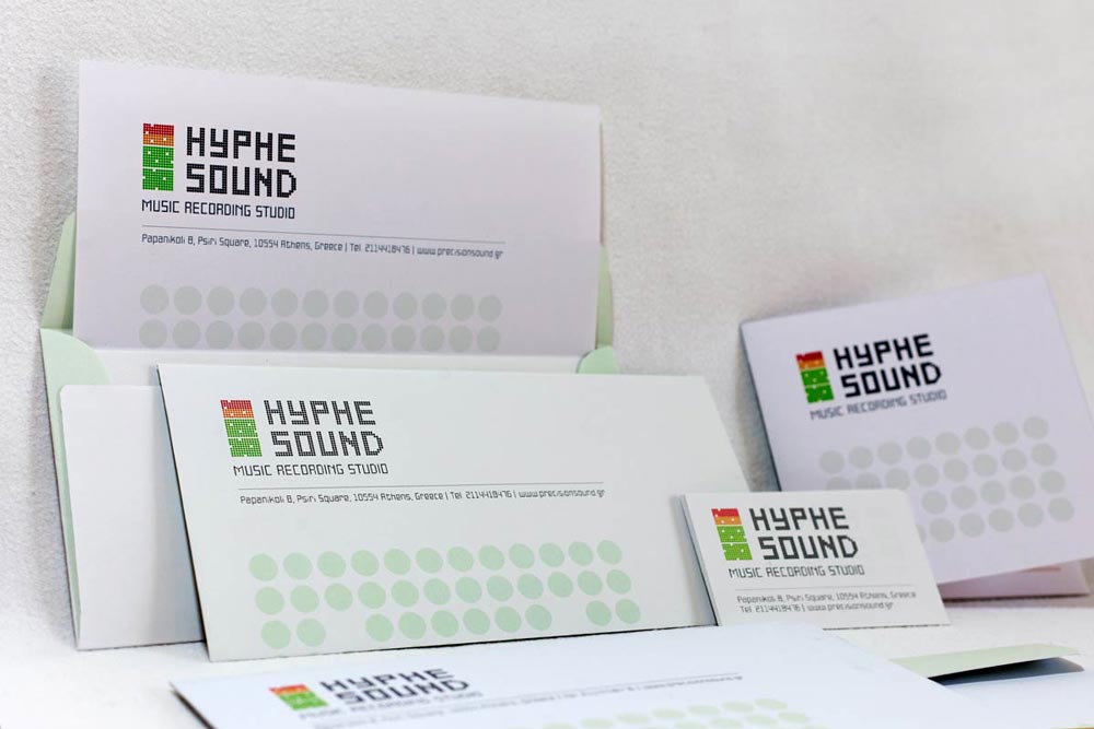
The Hyphe Sound identity centers around a distinctive symbol that translates audio frequencies into visual form, creating a memorable mark for this recording studio. The logotype features a stylized equalizer motif constructed from a dot matrix pattern, establishing a strong corporate identity that resonates with the technical aspects of sound engineering while remaining visually distinctive.
The color palette employs red, orange, and green—colors traditionally associated with audio levels in recording equipment—creating an immediate connection to studio production processes. This thoughtful color selection reinforces the brand's technical foundation while the dot-based typography introduces rhythm and movement to the composition, essential qualities in music production.
Our comprehensive branding approach extended beyond just the logo design, developing a complete visual language applied across stationery, promotional materials, and digital touchpoints. The system maintains excellent reproduction quality across various applications, from business cards and letterheads to digital platforms.
The resulting identity system communicates Hyphe Sound's professional capabilities while differentiating the studio in a competitive market through a visual approach that directly references the technical artistry of sound recording and production.
RECORDING STUDIO IDENTITY


